Fireplace: Decorative Moulding Dilemma
Welcome back to another installment of my fireplace project! Today's post covers Day 4 and 5 of the project -- decorative moulding!! This turned out to be much more challenging than I anticipated, simply because I couldn't decide where I wanted to put everything.
I had originally figured I'd install my rosettes below my header, as I felt like it widened the look of the surround (Option #1 below). Installing the rosettes in line with the header just made the surround seem too tall (Option #2).
But....I showed Brian these two options, and while I was voting for #1, he was adamantly voting for #2. So, I called in the tie-breaker. I emailed my mock-up drawings to my design buddy, Adrienne, who told me she honestly wasn't a fan of either one. Bummer, but I was very glad for the honest feedback.
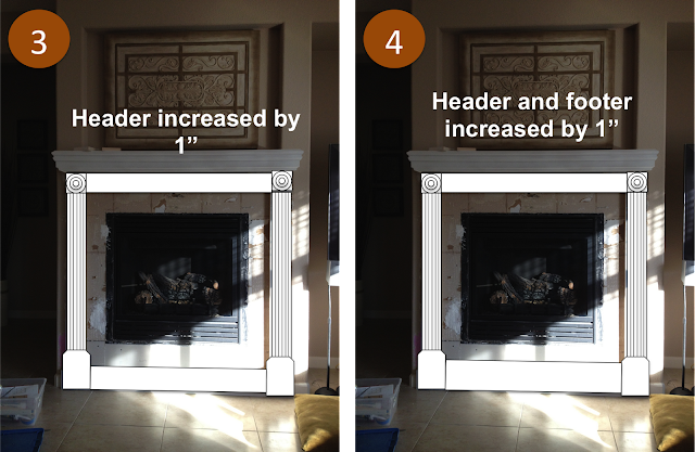
Adrienne suggested I fatten up the header so that the width of the header matched the width of the rosettes (Option #3 below). Huge improvement!! But then I had a new dilemma: I wanted my tile to look even above and below the fireplace, and by fattening up the header I was losing tiling space above the fireplace. So, I opted to fatten the footer as well, and very excitedly settled on Option #4.
So, I headed back to my local Lowe's and picked up a few more supplies, so that I could fatten up the footer and header by one inch.
Once that was done, I nailed some thin boards over the seams in the footer and the header, to smooth things out.
Next step -- patching and painting!
Cheers!!

When in doubt, draw it!! Or do a really lame photoshop job so you can see how it will look. And that's exactly what I did.
Here's where I left off in terms of the overall surround structure:
I had originally figured I'd install my rosettes below my header, as I felt like it widened the look of the surround (Option #1 below). Installing the rosettes in line with the header just made the surround seem too tall (Option #2).
But....I showed Brian these two options, and while I was voting for #1, he was adamantly voting for #2. So, I called in the tie-breaker. I emailed my mock-up drawings to my design buddy, Adrienne, who told me she honestly wasn't a fan of either one. Bummer, but I was very glad for the honest feedback.
Adrienne suggested I fatten up the header so that the width of the header matched the width of the rosettes (Option #3 below). Huge improvement!! But then I had a new dilemma: I wanted my tile to look even above and below the fireplace, and by fattening up the header I was losing tiling space above the fireplace. So, I opted to fatten the footer as well, and very excitedly settled on Option #4.
So, I headed back to my local Lowe's and picked up a few more supplies, so that I could fatten up the footer and header by one inch.
Once that was done, I nailed some thin boards over the seams in the footer and the header, to smooth things out.
And last but not least, I added some chunky base moulding to the header (installed upside down) and the footer to complete the look. Whew!!


You are amazing...great ideas and talent.
ReplyDelete